
1.8K
Canva provides you with many templates for an infographic. However, you also have the option of starting from scratch
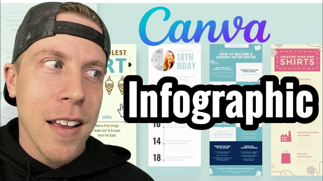
Canva: How to create an infographic
Open Canva and create a new project. If you want to start with a template, go to the start page instead and select a suitable template by entering “infographic” in the search bar.
- Click on “Create” and select the “Infographic” format from the suggested options or enter “Infographic” in the search bar to find suitable templates.
- Choose a template from the variety of pre-made designs Canva offers, or start with a blank canvas to create your infographic from scratch.
- Add text, shapes, icons, illustrations and images to visually represent your information. Use the tools in Canva to move, scale and customize elements. Customize colors and fonts to make sure your design is appealing and easy to understand.
- Add charts or graphs to present data and statistics. Canva offers various charting tools that you can use to visualize your data.
- Check your design for completeness and accuracy of information. When your infographic is ready, click on “Download” and select the desired file format (e.g. JPG or PNG).
- Save your infographic to your computer or share it directly from Canva via social media or email.
Tips for an understandable infographic
An infographic structures information and presents it clearly. It uses visual elements and also contains text.
- Clear structure: Make sure that your infographic has a clear and logical structure. Use headings, subheadings and paragraphs to organize the information into meaningful sections. These tools are available on Canva and are easy to use:
- Visual hierarchy: Use different visual elements such as size, color and placement to make the hierarchy of information clear. Important information should be highlighted. Less important information may take a back seat.
- Less is more: Don’t overload your infographic with too much information. Concentrate on the essentials and only present the most important data and facts. Use the Canva templates as a guide, for example. Here you can see how the information is structured
- Use of graphics: Use icons, illustrations, diagrams and graphics, such as a vector graphic, to present complex information visually. This makes it easier to understand the information and makes the infographic more appealing.
- Fonts and colors: Use a limited number of fonts and colors to ensure a consistent appearance. This helps to improve readability and make the infographic look more professional. Reduce the color selection to a maximum of three colors. Use one of them as an accent color to emphasize important things.
- Test the legibility: Make sure that the text is easy to read, even if it is displayed in a smaller size. Avoid overly decorative fonts or color combinations that could affect readability. In particular, infographics that are displayed on mobile devices, for example on Pinterest, should have a large font in order to be easy to read.
- Considering the target audience: Think about your target audience when designing your infographic. Adapt the style and language accordingly to ensure that the information is understandable and well received.